The Performance Overview dashboard is designed to provide the big picture of the current and historical rankings for you or your competition.
There's a lot of data here, so let's look at all the components one at a time.
Begin by selecting your desired brand or domain using the Rollup dropdowns.
You can further filter by Segment, Keyword Group, or date range.

The Metrics bar comes next. Here, you can see a mini chart of your performance for each of the metrics we track.
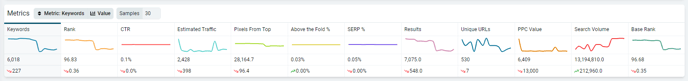
You can click on any of these metrics to change what is displayed in the History chart and the organization of the Keywords table.
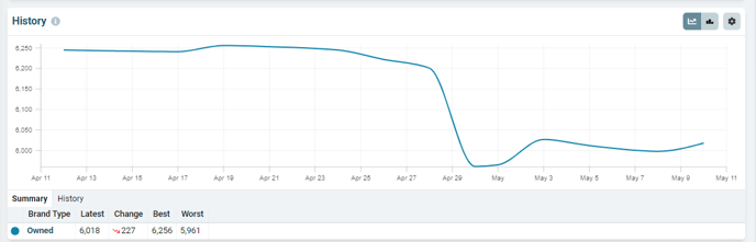
Speaking of the History chart, this is an effective way to catch site- or brand-wide trends, i.e., Have my rankings experienced an increase or decrease overall? How many keywords does my brand rank for? Do any of the rank fluctuations coincide with major Google updates or other events?
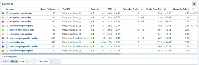
Next, you'll see the Keywords table where the keywords for the selected brand or domain are listed, along with their search volume, top URL, estimated traffic, rank, and other useful data.
If your Brand assets do not rank in the top 100 for those keywords, they will show as ranking at 101 (even if their actual rank is even lower). If all of these keyword show 101, the Metrics bar and History chart will say No Data Available.
You can sort the Keywords table by column to see the best or worst performers for those metrics (Rank, Pixels From Top, etc.).
The Settings Cog on each of these carts will also open up a number of other options (including exporting to a csv).
You can paginate through these results or go straight to another page of results or change the number of rows displayed by using the controls at the bottom of this table.
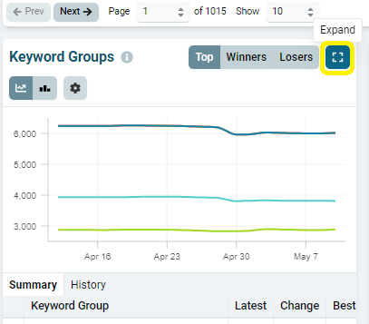
At the bottom of the Performance Overview dashboard, you'll find three charts that show a summary of some other dashboards: Keyword Groups, Segments, and URLs.
These charts offer a quick insight into how your rankings differ based on keyword group, segment, and URL. Use the Top, Winners, and Losers buttons to quickly see what is performing the best and the worst.
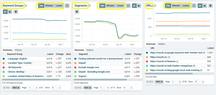 You can also expand these charts for a better view.
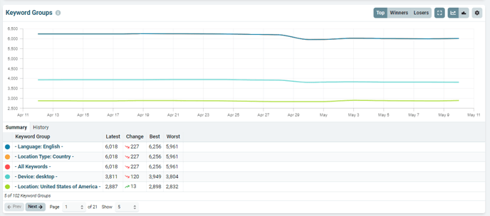
If you would like to get more details on each, you can go directly to those dashboards by clicking on its name in the chart or in the menu on the lefthand side of the dashboard.
Click the Settings Cog on the top right of each chart to manage its metrics, sorting, and values, or to export the chart's data to a csv file.
Just like the Keywords chart, you can paginate through these results or go straight to another page of results and change the number of items shown on each chart with the controls at the bottom of each chart.
For more information about Nozzle dashboards, click here.