Which dates does Nozzle use for comparing numbers in the change columns?
Nozzle displays how much each metric has changed over time. But how much time?
Nozzle will use the first date shown in the specified date range and compare that with the most recent date in the range. This data will be reflected in the change column.

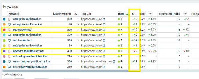
In the example below, the rank change column shows the difference in rank between September 5, 2022 and October 4, 2022, as specified above.

When you look at the charts for each individual keyword, they will also use this same date range for the comparison. For example:
"keyword rank tracker tool" is reported as 2 lower than it was at the beginning of the date range, even though it is technically 1 higher than it was ten days ago.

"seo tracker tool," on the other hand, rose by 10 of that date range:

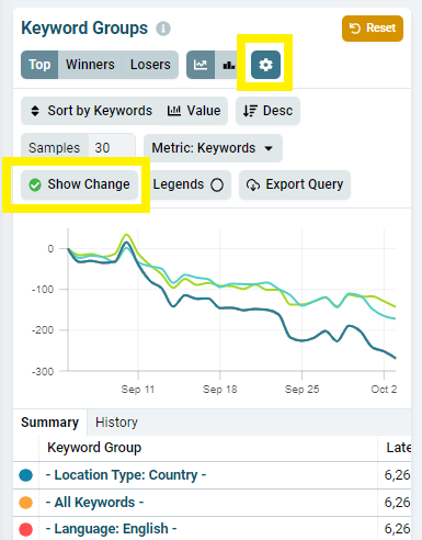
The Show Changes Button
For more detailed change data over time, use the Show Changes button above any chart to see the data graphed by metric change rather than metric value.

Changing the Date Range
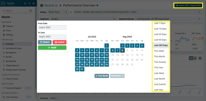
Click the date range button on any dashboard to change the dates you are comparing.
Use the preset date ranges on the right of the popup to quickly switch between certain time frames, or use the calendars to choose specific dates to compare.

You can compare any date range going back to the day we began collecting data on your keywords.