![logo-blue copy 2.png]](https://help.nozzle.io/hs-fs/hubfs/logo-blue%20copy%202.png?height=33&name=logo-blue%20copy%202.png)
Use the Competitors dashboard to analyze ranking data for your competitors.
By default, this dashboard displays ranking data for all your brands that have positions in the top 50 for your keywords. This can be a very useful way to discover new competitors.
However, you can also use the Focus dropdown to select specific brands, domains, or even URLs to see how you are doing against your competition.
You can also filter by date range, Segment, or Keyword Group as needed.

Below, you'll find the metric tabs that are on every dashboard as well as the Summary chart for the metric you have selected which lets you toggle the sorting between Top, Winners, and Losers.
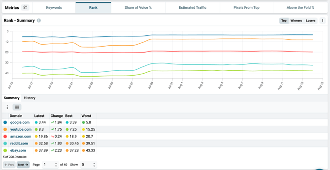
The table beneath these charts will display the Brands, Domains, or whatever you selected in the Focus dropdown. It has much of the same information, and you can choose to sort by different metrics to see how your competitors are doing in that area, and maybe even discover a competitor that is quickly making some big moves up the SERPs.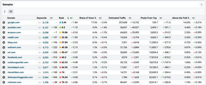
The Metrics tab in conjunction with the Segment dropdown is especially useful on the Competitor dashboard.
This is an effective way to discover which of your competitors are dominating in certain segments of the SERP.
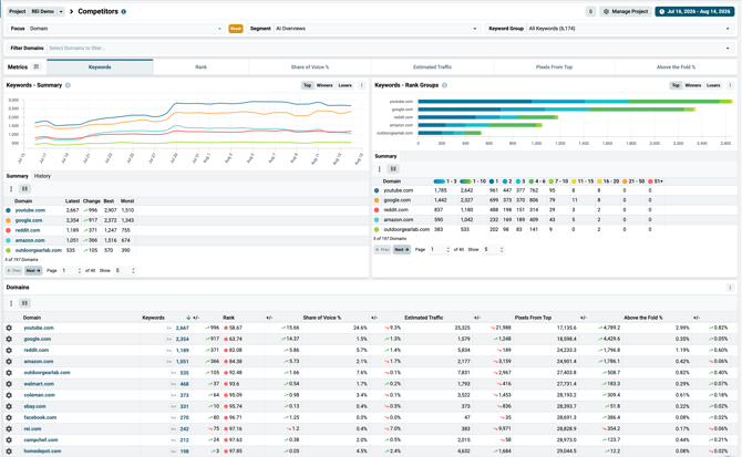
In the example below, you can see the AI Overviews segment has been selected, and we are looking at the keywords metric. This shows how many keywords each of our competing domains are cited in an AI Overview.
You can use any of the built-in segments or create your own to discover:
- Your top SERP competitors
- Who owns all the featured snippets
- Which of your competitors have the most video rankings
- Who owns local pack results
- And more!
For more information about Nozzle dashboards, click here.